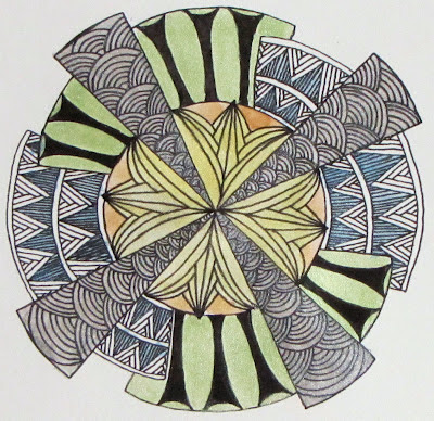
I took the idea of art deco and tried to apply it to my Zendala. I spent hours on Saturday looking at images on my computer trying to find patterns that I could adapt to the challenge. In the end, I didn't create anything new but the top of the Empire State Building did give me some great ideas for the future. But, like my wanderings on the Internet, I digress.
 |
| Deco 'Dala in black and white |
After I got this Zendala done, I wanted to play with color a bit. What I didn't want to do was to draw a second Zendala though. I was really quite happy with what I had already done so I just kept it. Taking some advise that Genevieve gave here at Amaryllis Creations, I photocopied the unshaded drawing onto watercolor paper. I bought some inexpensive pearl watercolors a month ago and got them out to try. I thought pearl would lend itself to art deco. Lots of shiny in art deco. :)
 |
| Deco 'Dala with watercolor |
I used the silver, gold, blue, green and yellow pearl watercolor and added it right over the top of the photocopy. The photocopy didn't smear or run with the water nor did it rub off with the brush. After I finished painting, I let it dry for a few hours. I noticed that the black of the photocopy was not as dark as I now had a nice shimmer over the top. I took my micron this morning, and went back over the lines were and the black popped out again. I could have left it where it was but I wanted a blacker black. I guess I ended up drawing the Zendala after all.
I hope you like them and welcome your comments and feedback.
i think they are both wonderful! i am partial to color, though, and i definitely like the pearl colors you used. it makes your zendala look like a totally different piece -both are wonderful, but the second is my favorite!
ReplyDelete(and i need to look up that Hi-C pattern!)
WOW! Have to say the color added something special to your already great zendala. Super job.
ReplyDeleteI agree with Alice, that both look very different because of the colour. Both are beautiful, but my favorite is the black and white :)
ReplyDeleteAnnemarie Huijts, Holland
I like them both, the colour gives it a different look, but either way stunning work. I love art deco. hugs lin
ReplyDeleteLovely Zendala, the center really provides a beautiful focal point and I love your choice of color!
ReplyDeleteI adore your style. It inspires me so much. You really nailed the Deco style with this one! And, as usual, the shading makes all the difference, making it pop from the page. Thank you for taking the time to share your thoughts and creations.
ReplyDeleteI love the color in your Zendala. It's so soft and subtle.
ReplyDeleteThanks for sharing your thought process - I love to read how people get to the end product! Both your zendala's are really well done, you've chosen great tangles to illustrate the art deco style. My fav is the black/white though the color sure does look wonderful in it's softness. Nice to be able to compare.
ReplyDeleteWow! I am really impressed at your use of art deco-inspired tangles. I especially love the Hi-Cs in the center--absolutely perfect for the style. Both are beautiful. I think the colored one looks more art deco, but I slightly prefer the black and white.
ReplyDeletenice opinion. thanks for posting.
ReplyDelete