There is a monotangle challenge this week at I Am the Diva. The challenge is to use tipple and only tipple. As I am currently working my way through some stencils, more on that in a later post, I wanted to work on a ZIA using the idea of this week's challenge.
I used my fish stencil, and not really sure what fish it is, I searched out the silhouette on google and I think that it is an Angel fish. I went with the markings of a French Angel fish. I used green and purple for the fish and blue and blue/black for the water. It may seem like a test for color blindness, but I think it works.
This post is short, but kids and work await. I hope that you have a great week! Happy 4th to American readers and a belated Canada Day to my friends to the north. Thanks for stopping by!
A spot for me to share my obsession with zentangles. Please contact me at TinkerTangles @ gmail.com should you have any questions or comments. Thanks for stopping by!
Showing posts with label Zentangle Inspired Art. Show all posts
Thursday, July 2, 2015
Wednesday, April 22, 2015
Earth Day 2015
The earth here in Delaware has started to really wake up and I am so glad! The leaves are popping out and early flowers have started to bloom. We even had our first thunderstorm this week. Spring is really here. Each year, over at The Diva, Laura posts an Earth Day challenge. This year is no different.
I tried another zendala this year. I adapted a mandala pattern from a book I have to make it more zentangle friendly (read opened some space for tangles) and gave it a go.
I am so happy with how it turned out. For the "water" I used a dip pen and Winsor & Newton blue ink. I love how the Crest 2 pattern turned out. I want to fill a whole page with those awesome waves. Look for this in another design soon. I used my green Sakura pen for the Garlic Cloves and Diva's Dance. A little ink wash and some white ink fescu finished out the center.
I hope that the weather is nice for you on this Earth Day. Thanks for stopping by and taking a look.
Wednesday, October 29, 2014
Tone on Tone Monotangle Ensemble
Say that title three times fast! Yeah, I don't want to either.
Sometimes over at the Diva, Laura throws us a challenge that is REALLY a challenge for me. This week the challenge is to use the tangle Betweed in a monotangle. Meaning, use only the tangle Betweed in your tile. This tangle is a challenge for me because it feels awkward to me as I make the strokes. Well, it does in the "traditional" way of creating it. I am much better at it when filling in a line or section but trying to do it in a circle really changes the feel of creating it. Why? I have no idea. My brain, sometimes she sees things and sometimes she don't. Anyway, as I contemplated even participating this week, I thought to myself that there is a reason it's called a challenge so suck it up and do it!
At first I tried to force Betweed into a tree shape. I had checked out a few of the wonderful entries this week and saw a lot of Halloween shapes so I wanted to try something different. I thought that if I could get a tree to work, maybe I could make it into a card for the holidays. Yeah, that didn't work out so well. It wasn't terrible, but not so good either. I didn't even finish the tile. I decided to move onto a new idea. But what?
In the last few days I have been using some of the Sakura Gelly Roll pens that I have collected as accents in my inktober pieces. I bought some of the glaze pens a while back. At the time I had an idea to use the black glaze on black paper and see how that looked. Like so many of my ideas however, I never got far. With the idea of using Betweed in the round, I pulled out my glaze pens, a square of black paper and a circle to trace, and I gave things a go.
I think that part of where Betweed hangs me up is the little spot of shadow. I always make my lines and then go back to add a shadow spot. This time using the glaze pen I tried something different. The ink in the pens really flows and will puddle on you quite easily. With that in mind, I started each line with a small circle and then made the line. If the pen is going to puddle on you, why not use it to your advantage? I was so excited that not only did the black on black stand out - the glaze ink has a nice shine to it - but the tangle turned out pretty well too. The scan has the paper more gray than black but it is still a good image of the tile. Since the line of the pen is "fat", I did these on a 5" square. I debated trying to shade this but I like it without shade so I left it alone. Once this one was finished, I was so excited by it I pulled out the rest of the set, matching colored paper and DID ALL THE COLORS! There is a clear glaze that I tried on a white paper but it REALLY didn't show up. For the white then, I used a Gelly roll glitter pen. After I got all of the colors done, I realized that I had 9 tiles so I have put them together in an ensemble. I think that I will put them in their own 5" frames and hang them in one big square on the wall. A few of the colors didn't scan so well. The tone on tone was hard for my scanner to see, that or maybe the shine of the ink threw it off a bit, but I think that you can get the idea.
Sometimes over at the Diva, Laura throws us a challenge that is REALLY a challenge for me. This week the challenge is to use the tangle Betweed in a monotangle. Meaning, use only the tangle Betweed in your tile. This tangle is a challenge for me because it feels awkward to me as I make the strokes. Well, it does in the "traditional" way of creating it. I am much better at it when filling in a line or section but trying to do it in a circle really changes the feel of creating it. Why? I have no idea. My brain, sometimes she sees things and sometimes she don't. Anyway, as I contemplated even participating this week, I thought to myself that there is a reason it's called a challenge so suck it up and do it!
![]() |
BeTreed (see what I did there?) |
In the last few days I have been using some of the Sakura Gelly Roll pens that I have collected as accents in my inktober pieces. I bought some of the glaze pens a while back. At the time I had an idea to use the black glaze on black paper and see how that looked. Like so many of my ideas however, I never got far. With the idea of using Betweed in the round, I pulled out my glaze pens, a square of black paper and a circle to trace, and I gave things a go.
![]() |
Black on Black |
Sorry that I made you get through all this rambling to get to the finish. :) Thanks for stopping by and for all of your lovely comments. Your support is invaluable to me.
Have a great week!
Tuesday, October 21, 2014
Pretty in Pink Flowers
October is Breast Cancer Awareness month. Over at the Diva's challenge, Laura is honoring her Grandmother who had breast cancer. The challenge is to use pink to honor someone you know that has/had breast cancer. I did zentangle inspired art to honor Laura's Grandmother, my Godmother, and my friend who all battled breast cancer and for my Aunt who had cancer but is luckily now cancer free.
While it didn't scan really well, the pink here has a little shimmer to it. I started by watercoloring the background and using a dip pen and india ink, drew my garden over the top. I used variations of Diva's Dance and Arc flower and the top flower is inspired by Charles Rennie Mackintosh. I think that someone has already done a step out for a pattern like it but I am not sure. I was going to shade with my prismacolor markers here but the paint really stopped that from happening. I'm not sure why, maybe the paint and the alcohol? but as I started, the marker picked up the pink as I went and was not doing nice things. So, I stopped and made a light wash with the india ink and used a small brush to shade. The outside shading is the marker.
I like the whimsy of the piece and even the pink (a color that I don't usually embrace). This is also doing double duty for my inktober drawing for today. Not too bad for a morning's work.
Thanks for stopping by and for all the wonderful comments each week. I appreciate them all, I just don't usually have time to go back and comment to everyone individually. Have a wonderful week!
Labels:
Arc Flower,
Breast Cancer Awareness,
Charles Rennie Mackintosh,
Dip Pen,
Diva Dance,
Diva's Challenge,
ink,
inktober,
JJ LaBarbera,
Pink,
Watercolor,
zentangle,
Zentangle Inspired Art
Wednesday, September 3, 2014
Get Your Coloring On

The app, Coloring Advanced Tangles launched this week in the App Store on iTunes. I am pretty excited to share this with you. There are two versions of the app, a paid and free version. Both are pretty great, the free version has ads. By clicking here, you can go to the store and download it today.
The app is really fun. John Young, the app builder, did a really great job. John built the app and I did all the artwork. If you download it, would you please take a moment to rate it?

If you download the app and/or buy the images in etsy, I invite you to share them with me on my Facebook Page. I would love to collect them in a folder to share with others (with your permission of course).
I really enjoyed creating the images for the app. It was fun to draw with a different frame of mind. While drawing, I needed to keep in mind that someone would be coming behind me to fill in the white areas with color and that I would not have shading to help me in popping out patterns to separate one from the other. The fun thing that I discovered was that thinking of those things, did not keep the process from being "zentangle". I can tell you that there is really something freeing and mindful in making the same pattern over and over again.

Making these pages was so fun that after I finished them, I almost immediately started on a full size coloring book. Naturally, you can also buy a copy of that in my etsy. The book made it's debut this weekend at the Arden Fair in my area. I can report that it was quite popular with people of all ages. Not only is it fun to color, but a great way to practice shading.
Thanks for stopping by and taking a look, oh, and listening to my sales pitch. I am really excited about the app and the coloring book. They have been the work of my summer and I have had such a fun time.
Sunday, May 4, 2014
Zentangle + Shrinky Dinks = FUN!
About this time last year, I got the idea to tangle some Shrinky Dink film and see what would happen. I thought that it would be fun to make some medallions to string on necklaces. When I am at Art and Craft shows, I find that pre-teen and teen girls are often very interested in my drawings but don't have the cash to invest in the pieces that they like best. There are note cards and prints available at the table but honestly, note cards are a thing of the past for these girls. Prints, well they will need frames. The idea of the necklaces I hoped would be a good idea, the price point isn't too much ($12 at shows and $14 on etsy) and if I do say so myself, they are fun. It turns out, that a lot of people like the necklaces notjust the younger girls. Each is an original piece of art, all are different, and even if I reused a template, it is unlikely that I would make it again in the same way. One zendala medallion even inspired me to turn it into a larger zendala on paper.
Any of you that also follow me on instagram (TinkerTangles) will often see these pieces as they progress. One of my followers there asked if I had a tutorial on how I created the necklaces. I have been thinking that I should do a post about them and the request has led me here today. So, I will do my best for you that are interested. Hopefully this will be helpful. Please let me know if I am not clear of didn't answer a question that you may have.
Many of you may remember Shrinky Dinks. I LOVED playing with them as a kid. Usually they came in packages with pre-printed designs that you then colored in with markers or colored pencils. Those can still be found online and probably in some stores. I use just blank sheets to create by medallions. You can also find all of their products on their website. There are a lot of choices there. I may have to do a little online shopping as I only have 3 kinds. I buy mine at Michaels. There are 10 sheets in a pack and I get at least 4 medallions out of each sheet. If you search shrink film on Amazon, you will find that there is another kind, I forget the name, but I have chosen to stay with a product I know. Speaking of products that I know, let me tell you what I use when drawing these.

Supplies:
1. Shrink film. I use Shrinky Dinks Crystal Clear, Frosted Ruff N' Ready, and Bright White.
2. Pens/Markers: I mostly use Sharpie MARKERS. The Sharpie pens will work on the Ruff N' Ready as the back is really rough and can eat the tip of your marker. The pens seem to hold up to that texture pretty well and doesn't bleed.
I also use the Sakura Identi Pens. They really work well and the double tip is nice so that different line widths can be made. The drawback though is that the colors are limited to primary colors and black. I like the color choices that Sharpy has.
I have also used the Bic Mark-It but I am afraid that they fade over time. So far I haven't had any reported issues, but I had one medallion that sat in the sun for a while and the darker colors faded. Probably because of the fact that it sat in the sun, but I don't want to take any chances.
3. Paint Pens: I use Oil paint pens. Water based ones don't want to work as well. I have used Sharpie brand, the Sakura Metallic pens and Deco Color pens. For all of them I use the extra fine or ultra fine point. I do have a few larger ones though. I use those when I want to fill in a large area or cover the back in one color.
Now for the nitty gritty, making your design. I first cut out my shape. It is easier to start that way to me. For the pieces that I am currently making, I keep the film to 4.5". My circles are 4.5" in diameter. Squares or other shapes can vary but I make a point to have my largest size 4.5". Remember that your film is going to shrink down, so keep in mind what size you want your final piece to be when you cut your film. A 4.5" circle shrinks down to about 1 3/4". Some of you may be more math minded and can figure out the shrink down percentage. I am not however, and just tried different sizes until I had what I wanted.
When it comes time to bake your film, I follow the directions that come in the package. They say a toaster oven is ideal but I use my regular oven and have great results. There are some that use a heat gun but I think that an oven is best. In an oven, the heat is even and since they need to be in the oven for 3 minutes, easier on your hand. A heat gun works great though if you have a problem area after shrinking and want to smooth an area out. I bake my film on parchment paper. The directions call for using a paper bag but I don't like the texture of the paper bags.
If you watch your film shrink is is both very cool and a bit scary. When the film starts to shrink, it is going to flop about, curl around and has even been known to flip over! Don't fret however and DO NOT yank it out of the oven. Let your film stay in the oven the full 3 minutes. It will correct itself and lay flat. Only once or twice have a had a piece fold over on to itself and stay that way. That has happened when I was trying to make a really small piece. Sometimes, my circles come out a bit wonky, I'm not sure why though. By wonky I mean that it isn't quite round anymore. More of an elongated circle.
Once your three minutes are up, you can take your piece out of the oven. THEY WILL COOL QUICKLY! I take mine out of the oven, lift the parchment and medallion off the cookie tray, and set the on the counter. I place a smaller piece of parchment on the top of the film, and use a small book to press lightly down on the film. (Don't use anything with a texture on it unless you want this texture pressed into the hot plastic.) This will help make sure the piece is flat. That doesn't mean that even then the piece is totally flat but usually it is. I have now decided what an acceptable level of wonky is. You can also return the pieces to the oven, it will not shrink more, but it will make the plastic pliable again so if needed, you can press them flat again.
Now for some tips.
The photo above is the first medallion that I made. It is on the Ruff N' Ready film. First I trace/draw the outline or string. Then I add my tangles and color.
Ruff N' Ready film. This film needs to have all of the rough parts colored in. You don't have to, but I don't care for the way it looks uncolored. Cheap colored pencils work great for this film. I use Crayola pencils. You can layer your colors with this. Just remember to do it in reverse. The shiny side is the side you are supposed to look at. Put down your color and add darker colors on top to create shading. Highlights are going to go down first. After these are done, I go back and add a layer of acrylic clear glaze over the rough parts. It seals the colors so that they don't get rubbed off.

Crystal Clear Film: You can draw on both sides of this film. Create your design on one side and flip it over to paint sections to add color. When you do it this way, the design on the front casts a shadow onto the color and gives it more depth. You can also use a marker to add color in your design like a coloring book. Lighter color markers give the finished piece a light catcher look.
Bright White Film: This film will take the Sharpie markers and the Oil markers really well. Sometimes after shrinking, the oil paint seems to sit differently on the film giving it a bit of an embossed look. Markers are smooth. If you want to be more traditional in bringing Zentangle to this medium, all you need is this and a black marker.
Pens: I have not been able to get micron pens to work on the plastic film. I find that it wipes right off. The same thing happens with the Sharpie Pens when drawing on the smooth film. Sharpies don't. The color can "puddle" at the end of a line though so you'll want to keep that in mind. The puddles can help to add "shade" where you'd like it. There are gray pens that you can use for shading but I haven't had much luck there. For me, the lighter the color the better. Colors will become darker and more intense when after shrinking so keep that in mind when choosing your color pallets.
A few examples of finished pieces:
Any of you that also follow me on instagram (TinkerTangles) will often see these pieces as they progress. One of my followers there asked if I had a tutorial on how I created the necklaces. I have been thinking that I should do a post about them and the request has led me here today. So, I will do my best for you that are interested. Hopefully this will be helpful. Please let me know if I am not clear of didn't answer a question that you may have.
Many of you may remember Shrinky Dinks. I LOVED playing with them as a kid. Usually they came in packages with pre-printed designs that you then colored in with markers or colored pencils. Those can still be found online and probably in some stores. I use just blank sheets to create by medallions. You can also find all of their products on their website. There are a lot of choices there. I may have to do a little online shopping as I only have 3 kinds. I buy mine at Michaels. There are 10 sheets in a pack and I get at least 4 medallions out of each sheet. If you search shrink film on Amazon, you will find that there is another kind, I forget the name, but I have chosen to stay with a product I know. Speaking of products that I know, let me tell you what I use when drawing these.

Supplies:
1. Shrink film. I use Shrinky Dinks Crystal Clear, Frosted Ruff N' Ready, and Bright White.
2. Pens/Markers: I mostly use Sharpie MARKERS. The Sharpie pens will work on the Ruff N' Ready as the back is really rough and can eat the tip of your marker. The pens seem to hold up to that texture pretty well and doesn't bleed.
I also use the Sakura Identi Pens. They really work well and the double tip is nice so that different line widths can be made. The drawback though is that the colors are limited to primary colors and black. I like the color choices that Sharpy has.
I have also used the Bic Mark-It but I am afraid that they fade over time. So far I haven't had any reported issues, but I had one medallion that sat in the sun for a while and the darker colors faded. Probably because of the fact that it sat in the sun, but I don't want to take any chances.
3. Paint Pens: I use Oil paint pens. Water based ones don't want to work as well. I have used Sharpie brand, the Sakura Metallic pens and Deco Color pens. For all of them I use the extra fine or ultra fine point. I do have a few larger ones though. I use those when I want to fill in a large area or cover the back in one color.
4. Cutting Tools: I am lucky in that I have a Sizzix eclips that I have started to use to cut my film. It is so much easier. The machine is so great and cuts like a dream on the shrink film. HOWEVER, you do not need to buy an expensive machine. (A friend split the cost with me or I wouldn't have one.) Before the machine I got a circle cutter. Martha Stewart makes a nice one and you can adjust the size to what you want your circle to be. Scissors can be helpful to trim edges or to cut squares and or cut around any particular shapes you are making. Hole punch is also good to have around. If you decide to create a medallion, you'll need a hole to attach it to the jewelry finishings. The size of a regular hole punch is a perfect size.
5. Jewelry Finishings: What you will need to make your necklaces, pins or earrings. I use very simple satin cord as a necklace and add a bail to the medallion to attach it. There are some shrink art crafters out there that make some INCREDIBLE pieces of jewelry. While their work is very inspiring, I am keeping mine simple. If you already make jewelry, you might have all the stuff to make some impressive pieces.
![]() |
My first medallion. The outline, the tangles, adding color and the final product. |
When it comes time to bake your film, I follow the directions that come in the package. They say a toaster oven is ideal but I use my regular oven and have great results. There are some that use a heat gun but I think that an oven is best. In an oven, the heat is even and since they need to be in the oven for 3 minutes, easier on your hand. A heat gun works great though if you have a problem area after shrinking and want to smooth an area out. I bake my film on parchment paper. The directions call for using a paper bag but I don't like the texture of the paper bags.
If you watch your film shrink is is both very cool and a bit scary. When the film starts to shrink, it is going to flop about, curl around and has even been known to flip over! Don't fret however and DO NOT yank it out of the oven. Let your film stay in the oven the full 3 minutes. It will correct itself and lay flat. Only once or twice have a had a piece fold over on to itself and stay that way. That has happened when I was trying to make a really small piece. Sometimes, my circles come out a bit wonky, I'm not sure why though. By wonky I mean that it isn't quite round anymore. More of an elongated circle.
Once your three minutes are up, you can take your piece out of the oven. THEY WILL COOL QUICKLY! I take mine out of the oven, lift the parchment and medallion off the cookie tray, and set the on the counter. I place a smaller piece of parchment on the top of the film, and use a small book to press lightly down on the film. (Don't use anything with a texture on it unless you want this texture pressed into the hot plastic.) This will help make sure the piece is flat. That doesn't mean that even then the piece is totally flat but usually it is. I have now decided what an acceptable level of wonky is. You can also return the pieces to the oven, it will not shrink more, but it will make the plastic pliable again so if needed, you can press them flat again.
Now for some tips.
The photo above is the first medallion that I made. It is on the Ruff N' Ready film. First I trace/draw the outline or string. Then I add my tangles and color.
Ruff N' Ready film. This film needs to have all of the rough parts colored in. You don't have to, but I don't care for the way it looks uncolored. Cheap colored pencils work great for this film. I use Crayola pencils. You can layer your colors with this. Just remember to do it in reverse. The shiny side is the side you are supposed to look at. Put down your color and add darker colors on top to create shading. Highlights are going to go down first. After these are done, I go back and add a layer of acrylic clear glaze over the rough parts. It seals the colors so that they don't get rubbed off.

Crystal Clear Film: You can draw on both sides of this film. Create your design on one side and flip it over to paint sections to add color. When you do it this way, the design on the front casts a shadow onto the color and gives it more depth. You can also use a marker to add color in your design like a coloring book. Lighter color markers give the finished piece a light catcher look.
Bright White Film: This film will take the Sharpie markers and the Oil markers really well. Sometimes after shrinking, the oil paint seems to sit differently on the film giving it a bit of an embossed look. Markers are smooth. If you want to be more traditional in bringing Zentangle to this medium, all you need is this and a black marker.
Pens: I have not been able to get micron pens to work on the plastic film. I find that it wipes right off. The same thing happens with the Sharpie Pens when drawing on the smooth film. Sharpies don't. The color can "puddle" at the end of a line though so you'll want to keep that in mind. The puddles can help to add "shade" where you'd like it. There are gray pens that you can use for shading but I haven't had much luck there. For me, the lighter the color the better. Colors will become darker and more intense when after shrinking so keep that in mind when choosing your color pallets.
A few examples of finished pieces:
![]() |
Geisha Inspired Zendala |
![]() |
Starry Starry Zentangle |
![]() |
![]() |
Different Zendala ideas |
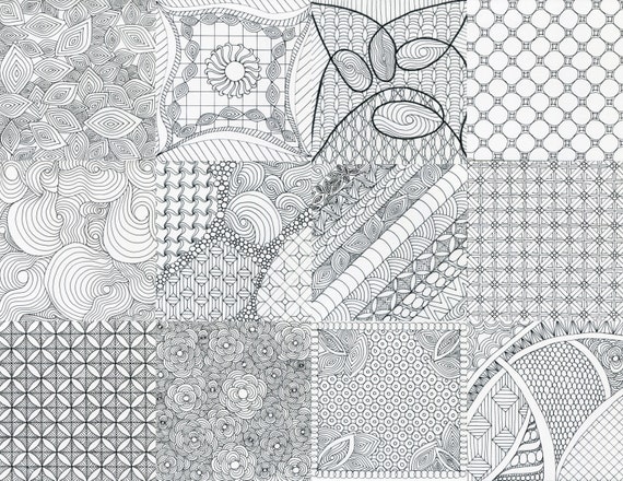
Saturday, October 19, 2013
Dot - Dot - Dot - Dot - Dot
This week the challenge that Laura put forward is Pointillism. I confess that I have never tried this style of drawing before, or at least, not that I can remember. I guess maybe I have as the tangle pattern Rain Dotty is pointillism. However, I have not tried to create a whole piece of art using just this style. I really focused on the method here. Trying to play with the dots to show more depth in some areas while little in others. I ended up doing two for this week. First I used an older micron on a square of watercolor paper. I followed Laura's example a bit and kept things non-tanglely at first but later added more defined pattern. After I was done, I went back and added a little pencil for shade in a few spots. After I was finished, I found more to the tile than I thought there was. Some of the sections, blend one into the other to create a curved look that I certainly didn't plan. As my teacher in college would say, it was a "happy accident".
Next I was drawn to give this method a try on canvas. I took a blank black canvas board I have and used white oil pen with a white charcoal pencil for shade. This one was really abstract. I just started tapping away over a minimum of pencil string and this is what I came up with.
It reminds me of a shoe. I'm not sure why but it does. I am pleased with how it turned out. What is it? Who cares?
I will certainly explore pointillism more and keep it in mind while working on my pieces.
Monday, September 30, 2013
They Might Be Zentangled.
One of my favorite bands is They Might Be Giants. I have loved the Johns and their music since college. Soon after my oldest son was born, TMBG came out with their first kids album, NO!, so I got to share their music with him. TMBG and all of their albums have taken us on many a long car trip in musical agreement.
Recently, the band played in Philadelphia for a free show with WHYY. The band played some new songs from their new album Nanobots but also many great classics that I have loved for years. One of the songs they played was Ana Ng. A great song that tells a great story but also has a line that says: "I don't want the world, I just want your half." As the song was playing, I was inspired to try and create a ZIA inspired by that line. It has been a while since I created a ZIA just for me so I thought that this would be a great one to do.
I started this one with just the circle and dividing lines drawn. I didn't use a string to further divide, I just went with designs as they came to me and went from there. This one is on watercolor paper and is 7.5" X 9". It is an odd size, but I wasn't thinking about that when I started.
Recently, the band played in Philadelphia for a free show with WHYY. The band played some new songs from their new album Nanobots but also many great classics that I have loved for years. One of the songs they played was Ana Ng. A great song that tells a great story but also has a line that says: "I don't want the world, I just want your half." As the song was playing, I was inspired to try and create a ZIA inspired by that line. It has been a while since I created a ZIA just for me so I thought that this would be a great one to do.
![]() |
I don't want the world, I just want your half. |
Now to nerd out for a moment. I have an instagram account (@TinkerTangles) where I post photos of my work as I go. It is fun for me to share my process and sometimes, if I get stuck, seek out some feedback from others. After I got the drawing done, I posted a snap of it and shortly went to bed. When I woke the next morning I found a comment. See that there, the one from they_might_be_giants? That is from the band! Not gonna lie, I almost shouted with glee. I'm a dork I know but that was so cool to see. My 13 year old was pretty impressed. TMBG is now one of his favorite bands as well, so he could share in my excitement.
I working on this drawing though, I learned a pretty important lesson. DO NOT LEAVE ART SITTING ON THE FUTON! I have a room in the house that I have taken over as my "studio". It does double duty as the guest room as well, so there is a futon in there. When guests aren't sleeping on it, the futon becomes a staging location for what I am doing. It's covered with paper, paper cutter, bags from Michaels etc. So, as my desk was full, I put the drawing on there while I worked on something else. The cat managed to scrape his claws across it and marked the paper. You can see it in the image. Luckily, I can remove the most visible marks in my photo program. I am going to get a limited number of prints made of this so, removing those scratches is important to me.
So, lessons learned, art made. I hope that you like this piece. Leaving so much "empty" space is something that I usually don't do. This one a fun one. It holds a personal meaning to me and was a lot of fun to do.
Wanna hear the song that inspired this? Check out this video:
Tuesday, January 29, 2013
Zendala challenge + color
I am behind on the Zendala dare that Erin hosts each week. I miss some weeks and I jump back in and something happens and I don't get back to post what I have done, if in fact, I have finished what I started. I have another that I finished drawing, but didn't get shaded. I'll be going back to finish that today but it's been so long since I drew it, I don't remember which dare it was. I'm working and that is the biggest thing.
So, color. It is something that I have dabbled with but it isn't easy for me. I tend to approach it like a coloring book. Draw the lines and fill them in. Shading with color doesn't really happen much for me. I've done a little but I default to using a pencil more often than not. I have some great pencils and markers reciently, Tombow markers, Inktense pencils and some Aquasitcks. I didn't really have much of an idea how to use them, or at least use them to get the most out of them. Thankfully there are some really great YouTube videos out there to see. Maybe one day, I will be able to actually do some of the tricks that are in the videos. :)
As I was doing Zendala dare #41, I decided that it needed to have color. The template looked like a flower to me, so a flower it would be. I traced out the template on 6"X6" watercolor paper and got to work. The center is a pattern by Jane Monk but please don't ask me the name. It isn't in the image that I have, but I think you can find it on tanglepatterns.com. I'm just too lazy to go and check it out right now. The rest flowed from there. I also concentrated on leaving some empty spaces.
Another color experiment that I did came along when I got stuck. The drawing was progressing well and then I got stuck. Unsure as to what to put in my empty spaces, I looked to a friend for a little help, her suggestion? Color. So with great hesitation, I went for it. Armed with Tombow markers, some water and a small paint brush, I went in. For this drawing, I did go back and add pencil for shade. I worked very deliberatly and carefully with the shading though. This was just an experiment to see what I could do with the color and shade. I learned a bit about me and shading as well as leaving some open space.
So, color. It is something that I have dabbled with but it isn't easy for me. I tend to approach it like a coloring book. Draw the lines and fill them in. Shading with color doesn't really happen much for me. I've done a little but I default to using a pencil more often than not. I have some great pencils and markers reciently, Tombow markers, Inktense pencils and some Aquasitcks. I didn't really have much of an idea how to use them, or at least use them to get the most out of them. Thankfully there are some really great YouTube videos out there to see. Maybe one day, I will be able to actually do some of the tricks that are in the videos. :)
As I was doing Zendala dare #41, I decided that it needed to have color. The template looked like a flower to me, so a flower it would be. I traced out the template on 6"X6" watercolor paper and got to work. The center is a pattern by Jane Monk but please don't ask me the name. It isn't in the image that I have, but I think you can find it on tanglepatterns.com. I'm just too lazy to go and check it out right now. The rest flowed from there. I also concentrated on leaving some empty spaces.
I am really pleased with how it turned out. Applying color evenly is a struggle for me, so I worked on that a lot as well as using darker shades and/or layering the color to get some suggestion of shade. I resisted the temptation to go in with a pencil and shade. I always want to pop the layers out but this is so sweet as it is, I was afraid that pencil would muddy it up.

Sunday, October 28, 2012
Stripes 2.0
Over at the Diva's blog, the challenge this week is to use stripes as a string. I have used this several times since the challenge was first posted last year. Using stripes can be fun and makes for a good visual. This time, I made my design large, I used an 8" square piece of watercolor paper and added red as a pop of color.
I added the challenge of red just to see what I could do with it, use it more as an accent rather than just drawing my patterns in red. In all it came out pretty good I think.
Thanks to the Diva for another great challenge. I'm sticking to a short post this week as we are looking at Hurricane Sandy to start effecting us soon and I wanted to get this out before we lost power. Luckily, we are inland. Water and wind will still be of concern, but we won't have to contend with the storm surge.
Stay safe everyone and have a great week!
Wednesday, August 22, 2012
Verve Experiments
Once I started making Verve, I can't seem to quit! Thanks to Linda over at Tangle Patterns, I've been seeing Verve in a new way. Linda used Verve in a way I had not imagined and it inspired me. One of the things I love about sharing patterns with other Tanglers is that patterns are used/created differently by everyone. Variations can be wildly different but so can basic technique and I love seeing all the different approaches.
Taking my inspiration from Linda, I created this piece that I am calling Tempest. I started with the darkened line first. It is a filled in Organza without any embellishment. I had thought I would go back and add to it later but I changed my mind. Then I added Verve behind it. In making Verve, I played with waving the lines more and varying the circles to see what would happen. I have to confess, this is probably one of my most favorite pieces and it's basically a monotangle. Anyway, it was a lot of fun to do and I wanted to share it.
Another thing that I have been trying to do with Verve it to find a way to connect circles one to another. I'm still working on it but I have done it a bit. In some places it is very Verve and then other bits it begins to look more like Auraknot. I think that you can see it a little in this Illuminated Letter I made. You can see it along the top. Like I said, a work in progress but I like how it looks. I did a Vortex-like bit in the circles there.
While there is more Verve to show, I'll just add one more image to this post. I wanted to give myself a challenge to use tangles in long, narrow pieces and see what I could come up with. I did a similar idea on an ATC and thought I'd take it a little larger. This one is on a 6" x 6" square. I also used some tangles that I haven't before and was plesantly surprised with how they came out. Coaster for example. I have not used it before. Why? I have no idea. I really like it and have seen it lots of places but I never tried it until then.
Well, I have had a long day of prepping for the Arden Fair and I am about to fall asleep sitting here. Thanks for stopping by and have a great week!
Saturday, August 18, 2012
Catching up on my Zendala Dare!
I've been busy and haven't taken the time to blog out my entries into the Zendala Dare by Erin. I'll post this entry to Dare #18 even though it also has zendalas from Dare #19 attached. Please forgive me. Things won't settle down around here for a few more weeks, and I fear that if I try and wait until then, I'll never get these up.
OK, Dare 18. I have to say that when I first looked at this pattern, I thought that I would do something floral and then this came out instead. I love when my pen decides to do it's own thing. I'm calling this Curiosity Zendala in honor of the landing on Mars. The patterns here made me think of vortexes and worm holes and space travel. My 11 year old son and I stayed up and watched the feed from NASA on the day the rover landed on Mars and I have to say that it was an incredible thing to witness. If you haven't seen the video of what was done you should. It is quite an amazing thing that the teams at NASA did. I am so glad that I stayed up to see it happen, even if it cost me some sleep.
I think that I'll try my hand at this template again and see if I can't get something floral to come out on the second go around.
Dare 17 was a personal one for me and for many others as it seems. My Mother died of Acute myelogenous leukemia (AML) in 2006. My Father has battled prostate cancer as has my Uncle and Grandfather. Luckily, all were treated successfully. So, for this template, I played up the ribbons in the design.
I first drew the background pattern of Bales and the edge of Ramykin and then made a photocopy of the basic design onto watercolor paper. Using watercolor pencils, I colored the ribbons to remember those I know with cancer. The Blue is for prostate cancer, pink for breast, (My God Mother died of breast cancer, my aunt battled it and I have a friend fighting now.) orange for leukemia and lavender for all cancers. The lavender is more pink that I would like but no matter. After painting the ribbons, I shaded the design.
I then went back to the original. I decided to keep it simple and let the ribbons stand proud. I added red hearts in the center of the Bales as a reminder of/for those we know who battle cancer. Leaving the ribbons plain, I also thought that it would be a zendala that could be for awareness of any/all diseases our loved ones face.
I have one more zendala to share with you all before I end this post. I made a donation to Erin's team and received the Thank You gift of even more zendala templates. They are all really wonderful and I can't wait to get pen to paper and explore them more. One of the templates however really spoke to me and I sat down and got started right away. My final piece is really quite simple and I love it so much! I am calling it Spring Zendala. For the first time I wish that I had the coloring skills that so many of you have as the desire to add green here is almost overwhelming. I'll keep it as is though.
I hope you all have a great week ahead and thank you for stopping by, taking a look, and leaving a comment if you'd like.
(I totally see now, that the spring zendala is turned the wrong way. I love however that it doesn't matter!)
![]() |
Curiosity Zendala |
I think that I'll try my hand at this template again and see if I can't get something floral to come out on the second go around.
![]() |
Cancer Awareness Zendala |
I first drew the background pattern of Bales and the edge of Ramykin and then made a photocopy of the basic design onto watercolor paper. Using watercolor pencils, I colored the ribbons to remember those I know with cancer. The Blue is for prostate cancer, pink for breast, (My God Mother died of breast cancer, my aunt battled it and I have a friend fighting now.) orange for leukemia and lavender for all cancers. The lavender is more pink that I would like but no matter. After painting the ribbons, I shaded the design.
![]() |
Awareness Zendala |
I have one more zendala to share with you all before I end this post. I made a donation to Erin's team and received the Thank You gift of even more zendala templates. They are all really wonderful and I can't wait to get pen to paper and explore them more. One of the templates however really spoke to me and I sat down and got started right away. My final piece is really quite simple and I love it so much! I am calling it Spring Zendala. For the first time I wish that I had the coloring skills that so many of you have as the desire to add green here is almost overwhelming. I'll keep it as is though.
![]() |
Spring Zendala |
(I totally see now, that the spring zendala is turned the wrong way. I love however that it doesn't matter!)
Tuesday, July 31, 2012
Floral Zendala
When I started this week's zendala dare, flowers were not on my mind. Yet, that is where I ended up. A few dares back, I used Hi-C's in the center of my zendala and wanted to use it again. To me, when Hi-C's is turned outward rather than inward, it looks like a lily. Now that I have this big lily in the center, I wanted to keep up with flowers and nature.
I used a variation of Versa and opted to fill in the space because I was in the mood for some black. The other side is Fife. I wanted there to still be black behind the pattern, but I wanted some contrast to the Versa. Around the boarder is my variation on Chainlea by Norma Burnell. When I get a moment, I'll step it out for anyone who may like to see it. I couldn't think of a pattern that I wanted to use in the open spaces so I took that as a sign that I should leave it as is.
This post is short as my boys keep coming in here to see if I'm finished with the computer yet. Plus, I need to get working on this week's Diva challenge also brought to us by the wonderful Erin.
Have a great day and thanks so much for stopping by!
Monday, July 9, 2012
Auraknot Challenge
At last! I am back to the Diva's Challenge. I have been too busy to finish or do the challenge for a little bit now and I am glad to be back at it.
Auraknot. I must confess, I was intimidated by this tangle pattern. It has so many steps and looks so complicated but I am glad I bit the bullet and tried it for this challenge. I have to say, I found it MUCH easier than it looks. I must also confess, that my star shape was traced from a cookie cutter. A big part of my fear of this pattern is the beginning outline. Starting with the outline done really helped me a lot. I think that I can do it without one next time.
Now that my confessions are over, I have to say that I am looking forward to using this again. I think that Auraknot will be a lot of fun to use. Creating this tile went quickly, aside from kid interruptions that is.
This one was done on a 6"X6" watercolor paper square. I found these at Dick Blick on Sunday and I HAD to buy some. I am not good a cutting a straight line so finding these was very exciting. They also have them in 8"X8" size. Whoo Hoo! The final size is more around 4" though. I want to take it and see if I can find frames and mats that these would fit into.
After getting Auraknot finished, I added the tangles around the out side. Please ignore the tangle on the lower right. It was to be one tangle but I messed it up so horribly, that i just had to flub my way through. It doesn't look too bad but still...
Thanks for stopping by and I can't wait to see what everyone else has done!
Playing with Paper: Zendala Challenge
I like to use watercolor paper when I create my Zengangles and my Zentangle inspired drawings. It is as close as I could find at the local craft store to the original tiles that you buy from Zentangle.com. But in all honesty, it is the paper I chose to use first before I had any tiles from Zentangle and now, it is the paper that I prefer. I like how it shades as well as takes the ink from the micro pens. Despite this, I was excited at the added challenge from Erin to use different paper in the challenge this week.
After reading the challenge, I decided that I was going to use origami paper. I love origami paper. I think that it is beautiful. However, I didn't have any. So, I loaded up the kids and we went to the store. If you've ever looked at origami paper, you'll know that there is a lot to choose from. So many colors and patterns! It was a bit over whelming. Plus, I didn't need a lot of it. Let's face it. I will not be trying the beautiful art of origami. I get type A about some things, but I don't think that I can be as precise as the folding requires.
But, I digress. While flipping though the paper I cam across paper that jumped out at me. The black and white patterns said "HEY ZENTANGLE!" to me. They are quite inspirational these little squares. I think that I may hang up some in my studio or use them as background paper to display some of my Zentangles. One thing I learned though is that that these patters are wonderful but they do not make great background to draw on. I find that they compete with the eye against the drawing. If I had to do it over, I would choose some larger patterns or some that are only color. I also used Sakura Gelly Roll pens for the drawing. I figured that the larger lines would help. You'll have to be the judge on that though. The origami paper also doesn't shade as well as watercolor paper.
Without further comment, I present my tries at the challenge. I made three on the origami paper. One in red, one in orange and one in black.
Again, I enjoyed the challenge. I really love the paper that I found. But I don't think that together, they were successful. Thanks Erin for another great Zendala template. I really like this one. So much that I am making yet another go at this template. This time it is on a 12" X 12" canvas and using paint pen. When I get it finished, I'll get a photo up.
Hope everyone has a great week!
After reading the challenge, I decided that I was going to use origami paper. I love origami paper. I think that it is beautiful. However, I didn't have any. So, I loaded up the kids and we went to the store. If you've ever looked at origami paper, you'll know that there is a lot to choose from. So many colors and patterns! It was a bit over whelming. Plus, I didn't need a lot of it. Let's face it. I will not be trying the beautiful art of origami. I get type A about some things, but I don't think that I can be as precise as the folding requires.
I know! Zentangle like! |
Without further comment, I present my tries at the challenge. I made three on the origami paper. One in red, one in orange and one in black.
Again, I enjoyed the challenge. I really love the paper that I found. But I don't think that together, they were successful. Thanks Erin for another great Zendala template. I really like this one. So much that I am making yet another go at this template. This time it is on a 12" X 12" canvas and using paint pen. When I get it finished, I'll get a photo up.
Hope everyone has a great week!
Tuesday, July 3, 2012
Summer Zendala
Well, I'm back. It has been a little while since I posted anything. Summer, the kids out of school and vacation in the Adirondacks has kept me from the computer. That does not mean that I haven't been busy though.
I am in a mad dash to get work ready for a neighborhood craft fair, The Arden Fair, that happens on September 1st. I love this fair so much. It is up the street from my house and is really wonderful. For the very first time, I will be an exhibitor rather than just a visitor. So, my pen has been busy, busy.
But, you are here to see this week's Zendala challenge. This challenge was a lot of fun I have to say. At first I was a bit stymied as to how I was going to get started but once I decided to use Brayd, I had my "theme" and I went from there. This is the first time I have used Brayd in a circle and I have to say, I'm quite happy with how it turned out.
I did the center with Arc Flower next and then the Featherfall. I didn't stay in the lines with these two so I wanted to get their uneven edges done first. This is my first real go at Featherfall. It came out pretty good but no where near as good as some of you do it. I have to keep trying it and get better at it. That being said, I do like it here. Keeping with "natural" tangles, I chose Beeline, Raindotty and Fescu to finish it out.
I am really thrilled with how this one came out. The shading really added a lot of depth to it and well, I just couldn't be happier. I am going to see if I can get art prints made up for the fair.
Now, a late entry into Challenge 11. I had this one drawn in time but held of shading it. I was trying to work out some ideas that I had but then I changed my mind and went back and shaded it this week.
This one was all line work. I just couldn't think of a way to get tangles into this one. There is good space, I used the large size template, but I was just out of ideas. I think it was because I had vacation on my mind.
I do like it. I am calling it "Trippy Zendala" as it looks more like a visual test than the usual zendala.
I wish I could think of more ways to add some shading here. I think more could be done to play with the perspective but I'm stuck. I don't want to go overboard so I stopped while I was ahead.
Thanks for stopping by and taking a look. It has been very hot here and I'm sure where you are as well. I do hope that you are all staying cool, or warm for those of you in the Southern Hemisphere, and are having a great day.
I am in a mad dash to get work ready for a neighborhood craft fair, The Arden Fair, that happens on September 1st. I love this fair so much. It is up the street from my house and is really wonderful. For the very first time, I will be an exhibitor rather than just a visitor. So, my pen has been busy, busy.
But, you are here to see this week's Zendala challenge. This challenge was a lot of fun I have to say. At first I was a bit stymied as to how I was going to get started but once I decided to use Brayd, I had my "theme" and I went from there. This is the first time I have used Brayd in a circle and I have to say, I'm quite happy with how it turned out.
![]() |
Brayd, Featherfall, Raindotty, Fescu, Beeline, Arc Flower |
I am really thrilled with how this one came out. The shading really added a lot of depth to it and well, I just couldn't be happier. I am going to see if I can get art prints made up for the fair.
Now, a late entry into Challenge 11. I had this one drawn in time but held of shading it. I was trying to work out some ideas that I had but then I changed my mind and went back and shaded it this week.
This one was all line work. I just couldn't think of a way to get tangles into this one. There is good space, I used the large size template, but I was just out of ideas. I think it was because I had vacation on my mind.
I do like it. I am calling it "Trippy Zendala" as it looks more like a visual test than the usual zendala.
I wish I could think of more ways to add some shading here. I think more could be done to play with the perspective but I'm stuck. I don't want to go overboard so I stopped while I was ahead.
Thanks for stopping by and taking a look. It has been very hot here and I'm sure where you are as well. I do hope that you are all staying cool, or warm for those of you in the Southern Hemisphere, and are having a great day.
Tuesday, June 12, 2012
Drawing Day 2012
Last year I found out about Drawing Day and participated. Luckily, I followed them on Twitter because that is how I was reminded about it again this year. I got my drawing done just in time to say I did it on Drawing Day but I failed to get it submitted in time to make it into the book. No matter, I made it into last years book.
For this, I started with three circles and then added a string around them to divide the space. After I added Knase to the upper right corner, I decided that I wanted to have black in the corners to give the edges some definition. Hollibaugh was a natural choice to carry that down. Knightsbridge and Crescent Moon, gave the same feeling but not quite as dark.
I am really pleased with how this one came out. It was a very enjoyable way to spend a Saturday.
![]() |
9X12 on watercolor paper drawn with Micron pen. |
I am really pleased with how this one came out. It was a very enjoyable way to spend a Saturday.
Zendala Dare #9
I have been so busy with the end of school that I have not been posting. I have been working though and hope to get caught up soon.
So, on to the challenge from Erin this week. This is the first pattern that Erin has created that has given me trouble. I think it is because I didn't "see" a design when I first looked at it. Often the idea for the design has come to my eye but not so this time. I really love this template. The shapes and design are really beautiful. The ovals though... They were such a stumbling block for me. I spent a lot of time just looking at this design and thinking about what tangles to use. In the end, I opted to keep it with line work. Once I made that decision, it wasn't any easier though. I started with Braids (I think that's the right name.) and went from there. In the end, I really love this Zendala.
The outer edge on the larger pieces is Ramy by Sandy Bartholomew from her book Totally Tangled. The larger ovals in the center I just made up a pattern. I wanted to mimic the Braids but not repeat it. I was pleased with how it came out. I'm not sure if there is another pattern like it already. I'll have to think up a name and draw up the steps. The small ovals at the center were done to bring Ramy back into the center. I opted to edge out the center and spaces between the tangles and fill them in black. I am so glad that I did. I saw the star shape in the center but I had not seen it on the outer edge until I filled it in. I love how shapes hide sometimes.
Thank you Erin for doing this challenge each week. Zendalas are quickly becoming a favorite of mine. Your templates are wonderful. When is your book coming out? :) I'd buy it.
Monday, May 28, 2012
Cabbage Rose Zendala
It is always amazing to me how Erin creates a template for the challenge each week and how different each person's work comes out. This week, my zendala became a flower. At first I wanted to make it into a budding peony but it came out more cabbage. I'm calling it a cabbage rose. It might be pushing it to add rose, but I'll see how far I can take it. :)
This is a really simple zendala for me. The tangle choices are few but this one didn't want to have a lot going on in it. I really like it and the shading makes it interesting for me.
Not a lot to write this week as I have a FULL plate at the moment. Lucky for you all.
One last thing, I finished shading the Sheriff's Zendala from last week's challenge. Rather than update the original post, I'll just tack it on here.
Happy Memorial Day! Have a great week.
This is a really simple zendala for me. The tangle choices are few but this one didn't want to have a lot going on in it. I really like it and the shading makes it interesting for me.
Not a lot to write this week as I have a FULL plate at the moment. Lucky for you all.
![]() |
Patterns: Fescu and Ixorus |
Happy Memorial Day! Have a great week.
Sunday, May 20, 2012
Starry, starry Zendala
This week Erin gave us the star treatment for the Zendala challenge. I get excited to see what Erin has come up with each week and then I am surprised at what my mind's eye sees in the design. In my first challenge I saw surfboards and in this challenge, I saw a sheriff's badge and gun. I fought that idea at first though. Guns and law enforcement are not exactly zen. Know what I mean?
So, fighting the idea of guns, I went first to flowers. I started in the center here and added Arc Flower to the circle. I put Knightsbridge in the center to give it a little more interest. Next I did the points of the stars. I was tempted with other patterns but I wanted to play with stripes. I divided the point to give the stripes a little more interest. I repeated Knightsbridge in the smaller circles for several reasons. One, I wanted to repeat to tie it in with Arc Flower and the other was to bump up the graphic-ness of the zendala. That left me with the beautiful scalloped section to work with. I was stuck here as I wasn't sure what to use. In the end, I kept it simple. I divided it into sections and drew lines. To my great surprise, the lines seemed to set the Knightsbridge circles off so I shaded them to further pop them up off the page.
I haven't gotten any of the round Zendala tiles yet. I'm putting them on my wish list though. Maybe for my birthday this fall someone will surprise me. I liked the idea of the circle so I just traced everything onto a piece of watercolor paper.
The whole time I was working on the Zendala above though, I could not get the badge and gun image from my mind. So, I decided to just do one anyway. I traced out the design on some drawing paper and went to work. I looked at images of sheriff's badges on line to give me some ideas of what they look like. Braided edges were often repeated so I used those. I added a few lines to reinforce the star. Then it was time for my gun. I found out that the chamber of a gun is not usually decorated. Not on the side that would be visible on this angle anyway. I tried to make the circles look as if we were looking through the chamber of an unloaded pistol. I haven't done any shading yet. I may go back and add some. The weather was so nice today that I went ahead and photographed this.
Thanks so much to Erin for creating these templates each week. I don't know how you do them, but I am so very glad that you do.
Subscribe to:
Posts (Atom)