Pages

Search This Blog

Showing posts with label HighC's. Show all posts

Tuesday, July 31, 2012

Floral Zendala

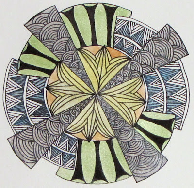
When I started this week's zendala dare, flowers were not on my mind.  Yet, that is where I ended up.  A few dares back, I used Hi-C's in the center of my zendala and wanted to use it again.  To me, when Hi-C's is turned outward rather than inward, it looks like a lily.  Now that I have this big lily in the center, I wanted to keep up with flowers and nature.

I used a variation of Versa and opted to fill in the space because I was in the mood for some black.  The other side is Fife.  I wanted there to still be black behind the pattern, but I wanted some contrast to the Versa.  Around the boarder is my variation on Chainlea by Norma Burnell.  When I get a moment, I'll step it out for anyone who may like to see it.  I couldn't think of a pattern that I wanted to use in the open spaces so I took that as a sign that I should leave it as is.

This post is short as my boys keep coming in here to see if I'm finished with the computer yet.  Plus, I need to get working on this week's Diva challenge also brought to us by the wonderful Erin.

Have a great day and thanks so much for stopping by!

Monday, May 14, 2012

Deco 'Dala

This week Erin at The Bright Owl created a Zendala template that reminded her of art deco design.  After I looked at it for a while, I had to agree.  I really do like the art deco style.  While it isn't a style that I would normally decorate with, I enjoy looking at examples and studying it.

I took the idea of art deco and tried to apply it to my Zendala.  I spent hours on Saturday looking at images on my computer trying to find patterns that I could adapt to the challenge.  In the end, I didn't create anything new but the top of the Empire State Building did give me some great ideas for the future. But, like my wanderings on the Internet, I digress.

Deco 'Dala in black and white
For this Zendala, I started in the middle.  I used Hi-C's here.  I really love Hi-C's because here it looks so art deco to me.  Here it looks like a lily, but if you put the pattern in back to back squares, it looks totally different.   It is a wonderful pattern because it looks so different in different places.  I used the arches on the triangle.  Does anyone know the name of this pattern in Zentangle?  It pops up a lot in art deco design.  I opted to keep the semi circle sections the same all across.  I just couldn't divide the space in a way that I liked.  I used a variation of Hibred.  It is kind of a blending of Hibred and Knase.  The black "columns" are a copy from an incredible art deco door I saw.  I wasn't sure that I liked them at first, but they came to grow on me.

After I got this Zendala done, I wanted to play with color a bit.  What I didn't want to do was to draw a second Zendala though.  I was really quite happy with what I had already done so I just kept it.  Taking some advise that Genevieve gave here at Amaryllis Creations, I photocopied the unshaded drawing onto watercolor paper.  I bought some inexpensive pearl watercolors a month ago and got them out to try.  I thought pearl would lend itself to art deco.  Lots of shiny in art deco.  :)
Deco 'Dala with watercolor

I used the silver, gold, blue, green and yellow pearl watercolor and added it right over the top of the photocopy.  The photocopy didn't smear or run with the water nor did it rub off with the brush.  After I finished painting, I let it dry for a few hours.  I noticed  that the black of the photocopy was not as dark as I now had a nice shimmer over the top.  I took my micron this morning, and went back over the lines were and the black popped out again.  I could have left it where it was but I wanted a blacker black.  I guess I ended up drawing the Zendala after all.

I hope you like them and welcome your comments and feedback.

Tuesday, May 1, 2012

Trying on a new size

A long time ago I picked up some artist trading cards at the craft store.  At the time I didn't know what they were.  I just thought the little 2 ½ X 3 ½ inches cards were cute.  They also come in a variety of papers so I thought it would be a great way to try out paper without a big investment.  Last week I tucked a package into my purse along with a micron.  My thinking was that I could pull them out at work when/if I get caught up and need something to keep busy.  I am interrupted often at work so an ATC is great.  A smaller size gives me smaller sections to work on, so I can fill them quicker and not worry about forgetting where I was.

So far I have finished one and am halfway through another.  I love these little tiles because they are a great way to practice patterns, or try out new ideas.  I know people trade these with each other but I have no idea where.  If you would like to trade or can advise me where to post for trading, I would love to know!

Friday, April 13, 2012

Illuminated Letter

I have finally finished a piece that I have been working on for several weeks.  Some friends of ours are getting married next weekend and I made a piece for them.  Usually I would get a couple something from their registry but these two don't want anything.  They have been together for a while and have bought or collected most of what a couple starting out would want.  Something they do have is a new home.  The house is really beautiful and has lots of wall space.  Naturally, I thought that I would make them something to hang on them!

I really admire the work done at the Zentangle Illuminated Letters master class that was held in Rhode Island.  What incredible art was made there.  Taking the idea, I decided to try my hand at making one of my own. 

I am not a calligrapher nor is my handwriting very good, so I chose a font that I liked and traced out my letter L.  From there I divided the space and kind of made it up as I went along.  I am quite pleased with the final product.

I toyed with the idea of adding some light washes of color with watercolor paint but I think I need to learn more and practice before I add to this work.  It is hard to see the shading here but the patterns really popped out once the shade was added.  This was done on 12"X18" watercolor paper using micron pens, pencil, and the Sakura Pen-touch gold marker.  I was going to use my gold leafing pen but it was not working well.  I think the pen-touch did a great job.  It covered really well and the shine is nice.

Friday, March 23, 2012

Curiosities

I just wanted to do a quick post on where the pattern Curio came from.  Here!


It's down there in the bottom right.  I have an online friend who lives in Ogden, UT that has opened a new little shop.  She asked people to send her postcards as she wants to post them all around her shop.  I had a 5X7" piece of watercolor paper around so I decided to make her a tangle.  I started with the word and went from there.  You can't see it in the photo here, but Curiosities has glitter on the letters.  I used the glitter pen from Sakura.  This is the first time I used HighC's and am really excited what happens to it when you put it in squares.  When I do it right it really looks art nouveau-ish.  :)

Anyway, this was really fun to do.  I might try some Zentangle inspired art  with words in the future.